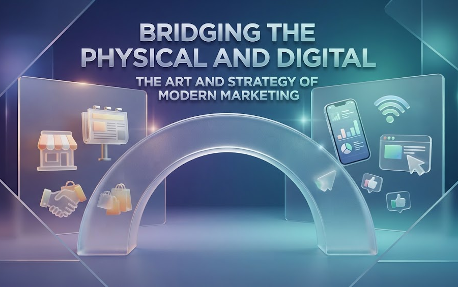
In a world rushing at the speed of a swipe, bridging the gap between the physical and digital has never been more critical. Whether you run a bustling neighborhood coffee shop, manage a growing boutique marketing agency, or design event passes for hundreds of attendees, the journey from a printed flyer to an online destination needs to be completely frictionless. Think about the last time you saw a flyer on a bulletin board or a menu on a restaurant table. Did you manually type out a long, clumsy URL into your phone browser? Probably not. You likely pulled out your camera, pointed it at a small black-and-white grid, and instantly arrived at your destination before you even had time to take another breath.
This simple pixelated square has quietly revolutionized how we share information, market products, and connect with audiences. Yet, despite how ubiquitous these codes have become, many businesses still treat them as an afterthought, slapping a blurry, poorly generated code onto a poster and hoping for the best. Creating a functional, professional, and visually appealing code is an art in itself. When you need a reliable, high-quality solution to bridge this gap, using a robust QR code tool can completely transform how your audience interacts with your brand, ensuring every scan is fast, reliable, and properly directed.
The Evolution of the Scan: From Industrial Tracking to Everyday Marketing
Originally invented in 1994 by Masahiro Hara of the Japanese company Denso Wave, these matrix barcodes were first designed to track automotive parts during manufacturing. They were engineered for speed and high-capacity data storage, far surpassing traditional linear barcodes in terms of efficiency. For years, they remained largely confined to industrial warehouses and supply chains.
Fast forward to today, and the context has shifted entirely. Smartphones eliminated the need for specialized handheld scanners, putting powerful decoding technology into the pockets of billions of people worldwide. During the pandemic, contactless menus and digital payment portals thrust these codes into the mainstream consciousness. Consumers no longer view scanning as a novelty; they expect it as a standard standard of convenience.
However, this widespread adoption comes with a catch. Because anyone can generate a pixelated square in a matter of seconds, the digital landscape is littered with poorly implemented codes that fail to scan, look unappealing, or direct users to broken links. If you want your campaign to stand out, your implementation needs to be deliberate, thoughtful, and professional.
Anatomy of a Great Code: Form Meets Function
A truly effective code does not have to be an eyesore. In the early days, you were stuck with a harsh, high-contrast black square on a stark white background. While that stark contrast is still necessary for readability, modern design standards allow for so much more flexibility without sacrificing functionality.
- Color Contrast: Your code needs a dark foreground against a light background. Inverting these (such as a white code on a black background) often confuses older smartphone cameras and leads to frustrating failed scans.
- Error Correction Levels: Codes contain built-in redundancy, meaning a portion of the code can be obscured or customized without rendering it unreadable. Choosing the right error correction level is vital, especially if you plan to place a logo in the center of the design.
- Clear Margins (Quiet Zone): Every code requires a distinct, empty border around its perimeter. Cramming a code right up against the edge of a flyer or packaging design will often cause scanning failures because the reader cannot isolate the matrix from the surrounding graphics.
Real-World Applications: Where and How to Use Them Effectively
To get the most out of your campaigns, you need to place your codes where they genuinely add value to the user experience. Here are a few ways forward-thinking professionals are utilizing them today:
1. Packaging and Product Information
Imagine a customer unboxing a complex piece of tech or a specialty skincare item. Instead of including a bulky paper manual that ends up in the recycling bin, print a sleek code directly onto the inner flap or product label. This can direct buyers to an unboxing video, an interactive setup guide, or a digital warranty registration page. It saves paper, reduces manufacturing costs, and provides a richer, multimedia onboarding experience.
2. Event Networking and Hospitality
At conferences, trade shows, or networking mixers, physical business cards are frequently lost or tossed away. Embedding a code on your badge or business card that links directly to your digital portfolio, calendar booking link, or LinkedIn profile ensures people can save your contact details with a single tap. Similarly, in the restaurant and hospitality sector, replacing static paper menus with a dynamic code allows businesses to update daily specials, wine lists, and pricing instantly without incurring endless reprinting costs.
3. Print Advertising and Out-of-Home Media
Billboards, magazine ads, and transit posters have limited space for text. A compelling headline paired with a clear call-to-action—such as “Scan to claim your 20% discount”—creates an immediate bridge between passive viewing and active engagement. It also gives marketers precise tracking capabilities, allowing them to measure exactly how many conversions originated from a specific physical location.
Best Practices for Seamless Execution
Even the best-designed campaign can stumble if basic technical and strategic principles are ignored. Keep these rules of thumb in mind before sending your design off to the printer:
- Always Test Before Mass Printing: Never rely solely on a digital preview. Print out a physical sample at the exact size it will appear in the wild, and test it using multiple devices (both iOS and Android) under varying lighting conditions.
- Use Dynamic Links When Possible: If your destination URL ever changes, a static code will instantly become useless. Utilizing dynamic tracking allows you to update the underlying destination link whenever necessary without having to reprint thousands of physical assets.
- Keep the Call-to-Action Clear: Never assume people will instinctively know what to do. Always include a short, punchy instruction next to the code telling them what benefit they will receive upon scanning.
Final Thoughts
The small, pixelated squares we see everywhere today are much more than mere graphic elements, they are dynamic gateways connecting the physical world with the limitless possibilities of the digital landscape. When approached with care, attention to detail, and a focus on user experience, they stop being a mere convenience and become a powerful tool for storytelling, marketing, and connection. Take the time to design yours thoughtfully, test them rigorously, and watch how smoothly your audience follows you across the digital threshold.